The Copyist’s Creed
The job of the copyist is probably one of the most responsible in music - one only need a single experience with badly written out music to know how much time it adds to a rehearsal, and as we all know, in the music business, time is a precious commodity!
I have been trained by composers who highly value notation, and I have taken this practice to heart. I am a detail person by nature, and my hands on experience with music making in many different contexts adds a great sense of responsibility to the way I set out my scores and typeset parts.
I use the industry standard tools of Dorico, Sibelius and Finale, and I have a large body of reference material to make sure that my approach is well executed, including Elaine Gould’s indispensable tome on notation “Behind Bars”.
I always use the most modern and up to date methods for presenting music to the performers in order to make their lives easier, even if it means dragging old or badly typeset scores and parts right up to date.
Antiquated clefs modern singers may not be familiar with
Case Study 1 - Choral Score
Turning this…
Odd time signatures.
…into this…
Fully written out plainsong for every verse
Standard, tried and tested staff size for choirs
Better spacing of the bars, thereby reducing visual clutter, and aiding readability and navigation
Fully written out keyboard reduction, aiding accompanist in rehearsals
Modernised vocal notation, including slurs for all melismata and beaming for quavers/eighth notes
Bar numbers as standard for navigation
Only one line of plainsong, with no indication of how the inner verses should be sung.
No slurs over melismata - antiquated at best, plain incorrect at its worst!
No reduction for rehearsal.
Case Study 2 - Chamber Music Part
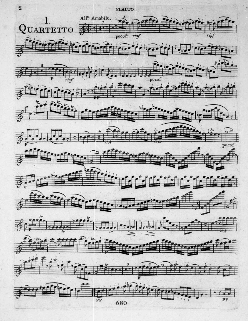
There are not many editions of the music of François Devienne around, leaving performers with little choice but to use facsimiles of the original. Unfortunately, they are fairly hard to read, as we can see below in the flute part of the 1st quartet op.66:
Very cramped on the page
Dynamics are very small and easy to miss. They are also often fouling the stave lines, thus making them hard to read
No bar numbers or rehearsal marks at all, slowing down navigation in a rehearsal.
Unusual placement of poco-forte and rin-forte markings: not immediately clear which notes the forte applies to
Antiquated typeface for dynamics. While not necessarily “wrong”, there’s a reason why the modern dynamic typeface is the way that it is today: it’s much easier to read!
On a personal note, these facsimiles are not always reliable - when I performed these with my flute quartet, we found a number of errors in them.
Some of these difficulties in reading can be attributed to the limitations of the late 1700s on the poor long suffering copyist who first made these editions in Paris, and others to the antiquated nature of the typesetting: remember that these were engraved by hand on what we'd consider quite primitive tools. These combined, however, make for a much more difficult experience for the performers of today to bring to life the composers of old.
Therefore, as I said in my precis above, it is my mission to drag badly typeset music, kicking and screaming, into the modern age. Using my experience, the above part goes through quite the transformation into what you see below:
Bar numbers and rehearsal marks as standard, easing navigation, and making rehearsals easier and more efficient
Much better spacing of the music in a standard 7mm staff size, tried and tested for ease in reading in instrumental parts
Standardised dynamic typeface and spacing: it is now perfectly clear to which notes the dynamics apply, as the principle dynamic mark (e.g. Forte or Piano) is positioned under the note to which it starts, as per conventional modern notation practice.
More consideration given for page turns. For example, after this bar, there are four bars of rest: a much better setup for page turns than the facsimile part!
Current & Previous Clients
Publishing Houses
Institutions and Ensembles
Arminico Consort
Choir of Peterborough Cathedral
King’s College London
Self Isolation Choir
Bosworth Music GmbH
Chester Music
Wise Music Group
Composers
Conductors
Patrick Hawes
Sven Helbig
Amy Summers
Errollyn Wallen
Judith Weir
Dr Joseph Fort
Patrick Allies


